How to Read a Spectrum Analyzer: A Mixing & Mastering Guide
How to read a spectrum analyzer for mixing and mastering: the frequency and dB axes, peak/RMS/average modes, FFT and slope settings, and reference comparison.
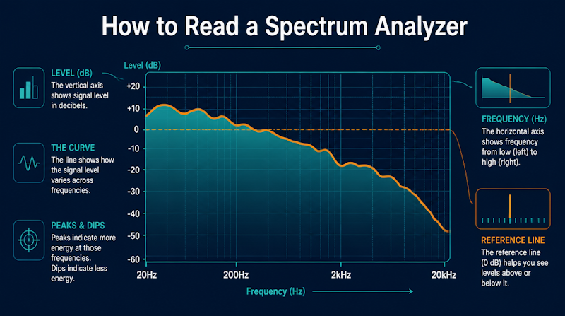
Even when you reach for an EQ or compressor, it can be hard to judge by ear alone exactly which band to touch and by how much—one of the first walls people hit when they start mixing in a DAW (digital audio workstation). This is where a spectrum analyzer helps. It visualizes how a sound's energy is distributed across frequency in real time, letting you objectively confirm problems that are tricky to hear, such as too much low end or a lack of highs. This guide explains how to read a spectrum analyzer step by step: the screen's two axes, the different display modes, FFT settings, what to look for in each frequency band, and practical uses in mixing and mastering.
What a Spectrum Analyzer Is: A Tool to "See" Frequency
Before reading the screen, it helps to understand what the tool actually shows. Knowing the principle tells you where to look.
Definition of a Spectrum Analyzer
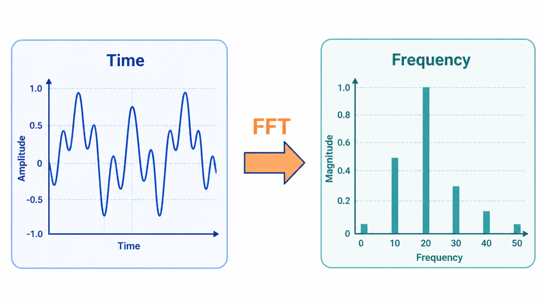
A spectrum analyzer measures the magnitude of an input signal versus frequency (Wikipedia: Spectrum analyzer). Where an oscilloscope puts time on the horizontal axis, a spectrum analyzer puts frequency on the horizontal axis and amplitude (level) on the vertical axis. That lets you see how much energy sits at each frequency, plus dominant frequencies, harmonics and distortion that are hard to spot in the time-domain waveform.
FFT Turns Time Into Frequency
A waveform is fundamentally information about time, and the calculation that converts it into a frequency distribution is the Fourier transform. In digital audio this is done with the Fast Fourier Transform (FFT). A Fourier transform "converts a signal from its original domain (often time or space) to a representation in the frequency domain and vice versa," and the FFT makes that computation efficient enough to run in practice (Wikipedia: Fast Fourier transform). A spectrum analyzer in your DAW runs the incoming audio through the FFT in short slices and continuously redraws the result.
Why Check With Your Eyes, Not Just Your Ears
Human hearing is not equally sensitive at every frequency, and your judgment drifts over a long session. Seeing the distribution confirms tendencies—"the low end is heavier than I thought," "the highs are thin"—as objective evidence. The final call is always made by ear, but the analyzer gives your EQ and compression moves a rationale. For the basic EQ and compression moves themselves, see our intro to mixing with EQ and compression.
Reading the Screen: The Horizontal and Vertical Axes
Now for the main event. Start with the two axes—frequency (horizontal) and level (vertical). Understand these two and you've grasped most of the display.
Horizontal = Frequency (Hz): Logarithmic vs Linear
The horizontal axis is frequency in Hz. What matters is whether it is shown on a logarithmic or a linear scale. In music production the log scale is standard, because each octave occupies equal visual width, matching how we perceive pitch (Audacity Manual: Plot Spectrum). A linear scale gives equal width per Hz, which crams the musically important low and mid content into the left ~20% of the display—useful for scientific analysis or very high harmonics, but not for mixing.
Vertical = Level (dB): The Display Range
The vertical axis is amplitude, i.e. loudness, in dB. Higher means more energy at that frequency. Many analyzers let you switch the vertical range. FabFilter Pro-Q's analyzer, for example, offers a range of 60 dB, 90 dB (default) or 120 dB (FabFilter Pro-Q: Analyzer). A wider range reveals quieter detail but makes the overall peaks look low and flat. Start with the default range and get used to reading the relative relationship between peaks.
Slope (Tilt) Changes How It Looks
Often overlooked, the analyzer's slope (tilt) setting can completely change the shape of the graph for the same audio. Because our ears don't weigh all bands equally, a slope is applied so that "flat on screen" roughly means "flat to the ear." FabFilter Pro-Q's default tilt is 4.5 dB/oct, chosen to produce a natural look resembling human loudness perception (FabFilter Pro-Q: Analyzer). If instead you want pink noise to read as flat, you set 3 dB/oct. Two tools with different slopes won't match shapes, so the first step is knowing your own tool's slope in dB/oct.
Display Modes: Peak, RMS, Average and Real-Time
The same audio looks different depending on how the analyzer aggregates it. Knowing the common modes keeps you from misreading what you see.
Real-Time and Peak Hold
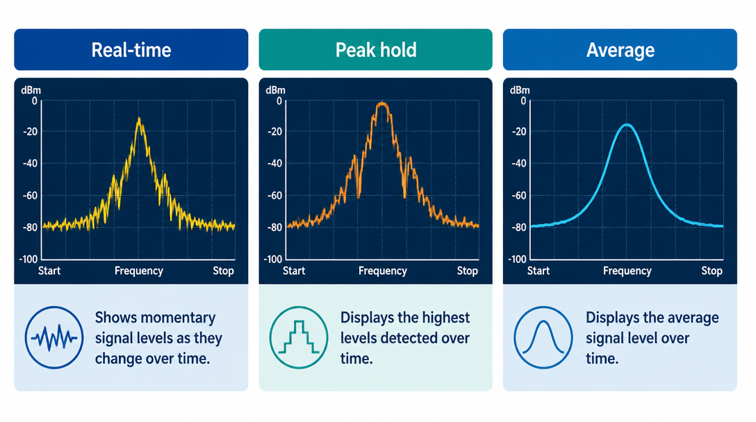
Real-time draws the instantaneous frequency content moment to moment, jumping around with the audio; it's good for catching harsh resonances and sharp transients. Peak hold keeps and displays the maximum reached at each frequency, so you don't miss momentary spikes. Tools like Voxengo SPAN can overlay "real-time maximum" and "all-time maximum" on top of the live spectrum (Voxengo SPAN).
Average and RMS
Average smooths values over a window of a few seconds, which is ideal for judging overall tonal balance (the broad low-to-high distribution). Relatedly, RMS (root mean square) measures average loudness over roughly 300 milliseconds and is useful when comparing your track to a reference (The Producer School: Metering 101). Instantaneous readings jitter too much to read, so use an averaging mode when checking tonal balance.
A Healthy Mix Still Moves
If the average line is smooth but the real-time peaks never move, dynamics may be crushed by over-compression. As a rule of thumb, a mix with intact transients shows instantaneous peaks jumping a few dB above the average level. For leveling bands with a multiband compressor, see our guide to multiband compression.
FFT Settings: Resolution, Windowing and Smoothing
How detailed and how fast an analyzer reacts is set by its FFT options. Understanding these lets you fix the display yourself when it won't behave.
FFT Size and the Resolution Trade-off
A larger FFT size (the number of samples analyzed) gives finer frequency resolution but coarser time resolution—improving one worsens the other. For instance, a 1024-sample FFT at 44.1 kHz yields 512 frequency bins, about 43 Hz of frequency resolution and about 23.2 ms of time resolution (Audacity Manual: Plot Spectrum). FabFilter Pro-Q lets you pick Low = 1024, Medium = 2048, High = 4096, Maximum = 8192 points, where higher settings add low-frequency precision but update more slowly (FabFilter Pro-Q: Analyzer). Use larger sizes to inspect the low end and smaller sizes to watch rhythmic, transient detail.
FFT size (example) | Frequency resolution | Time resolution | Best for |
|---|---|---|---|
512 | Coarse | Fast | Rhythm and transients |
1024 | ~43 Hz (at 44.1 kHz) | ~23.2 ms | Balanced default |
4096–8192 | Fine | Slow | Precise low-end analysis |
Figures are approximate for 44.1 kHz with a 1024-point FFT (Audacity Manual).
The Role of Window Functions
Because the FFT analyzes the signal in blocks, the discontinuity at each block's edges shows up as spectral smearing. A window function reduces this. Audacity's manual recommends the default Hann window for most situations and describes the rectangular window as the least desirable choice (Audacity Manual: Plot Spectrum). When starting out, leaving the window at its default is fine.
Overlap and Smoothing
Most analyzers also offer an overlap setting (how much analysis blocks overlap) and smoothing to make the display easier to read. Voxengo SPAN lets you specify the FFT block size, the window overlap percentage and the visual slope, and can smooth the spectrum for easier examination (Voxengo SPAN). More smoothing shows the broad trend; less smoothing reveals fine bumps such as sharp resonances.
Reading the Frequency Bands: What to Watch Where
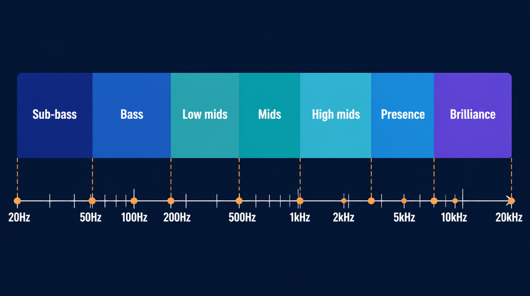
Once you can read the screen, the next question is what to look for in each band. The audible range of 20 Hz–20 kHz is conventionally split into several bands (the exact boundaries vary by tool and engineer).
Lows (Sub-Bass and Bass)
Sub-bass, roughly 20–60 Hz, is "felt" more than heard—deep rumble with little recognizable pitch. The bass band, 60–250 Hz, holds the body of the kick and bass and the track's center of gravity. Too much here muddies everything; too little saps power. Because the low end looks very different depending on your monitors, cross-checking with the analyzer keeps your judgment steady. See our guide to choosing studio monitors.
Mids (Low Mids and Mids)
The low mids, 250–500 Hz, carry the fundamentals of vocals and guitars and the body of toms. Boost too much and it sounds boxy; cut too much and it sounds thin. The mids, 500 Hz–2 kHz, are where instruments are most crowded and most likely to collide (mask each other). Checking whether multiple parts peak at the same spot gives you a clue about where to clean up.
Highs (High Mids, Presence and Brilliance)
The high mids, 2–4 kHz, define edge, clarity and attack, helping instruments cut through. Presence, 4–6 kHz, adds consonants, edge and close detail, while brilliance, 6–20 kHz, carries air and texture. Too much up top is harsh; too little sounds dull. The table summarizes each band's role.
Band | Approx. range | What lives there / what to watch |
|---|---|---|
Sub-bass | 20–60 Hz | Felt rumble; watch for excess |
Bass | 60–250 Hz | Body of kick and bass |
Low mids | 250–500 Hz | Fundamentals and warmth; boxiness |
Mids | 500 Hz–2 kHz | Crowded; masking-prone |
High mids | 2–4 kHz | Edge, clarity, attack |
Presence | 4–6 kHz | Consonants, close detail |
Brilliance | 6–20 kHz | Air and texture |
Using It in Mixing and Mastering
With the basics covered, here's how to put the analyzer to work. There are three practical uses.
- Compare: match your frequency balance against a polished commercial reference track
- Find collisions: hunt for masking where multiple parts stack in the same band
- Check against a curve: compare to a reference curve such as pink noise to judge excess or lack
Compare to a Reference Track
The most practical use is to run a polished commercial track (a reference) and your own mix through the same analyzer and compare their frequency balance—low-to-high distribution, bass-to-treble ratio, midrange density. The RMS mode mentioned earlier helps you level-match for that comparison (The Producer School: Metering 101). Tools like Voxengo SPAN that overlay multiple spectra make this even easier (Voxengo SPAN).
Find Masking
When two or more parts fight for energy in the same band, they bury each other—this is masking. Look at where each part peaks, find big overlaps at the same frequency, and that's where EQ should carve out space. FabFilter Pro-Q can overlay the pre- and post-EQ spectrum so you can see the effect of your moves (FabFilter Pro-Q: Analyzer). To separate parts left-to-right, see our guide to panning and stereo imaging; to separate them front-to-back, our guide to reverb and delay.
Use Pink Noise as a Reference Curve
When judging overall tone in mastering, pink noise is a common reference. Its power spectral density is inversely proportional to frequency, falling off at roughly 3 dB per octave (equal energy per octave), and because it resembles natural phenomena it is a handy audio reference (Wikipedia: Pink noise). A long-standing technique is to pass pink noise through a system, check whether the response is flat, and correct it with an equalizer if not. For more on how noise is classified by spectrum, see Wikipedia: Colors of noise. Finished tracks can be released worldwide through distribution services; music produced and distributed by Daito Iwasaki, a gymnast turned artist, can be heard on the Daito artist page. For the loudness stage, see our guide to mastering basics (loudness standards and finishing before release).
Cautions: Your Ears Lead
As useful as it is, leaning on the analyzer too hard can backfire. Finally, a few mindsets for using it well.
Don't Judge by Eye Alone
The display is a clue, not the answer itself. FabFilter notes that its EQ collision detection is "merely an indication, and not exact science," and urges using your ears alongside the visual analysis (FabFilter Pro-Q: Analyzer). Don't let "make the graph flat" become the goal in itself.
Don't Fear Empty Bands
Seeing a gap and thinking "I should fill it" is risky. For some songs, having less energy in a given band is correct. Unless a track is clearly skewed compared to references, there's no need to force-fill a dip in the display.
Pair It With Your Monitoring
The analyzer gives objective information that isn't swayed by your room or speaker coloration. That's exactly why the ideal is to judge with both—what you hear on your monitors and what the analyzer shows. The low end especially varies a lot by monitoring, so pairing eyes and ears raises your accuracy. For the musical foundations of a track itself, see our guide to music theory basics (scales, keys and diatonic chords).
Summary
A spectrum analyzer visualizes a sound's energy distribution and gives mixing and mastering an objective footing. Here are the key takeaways.
- Horizontal = frequency (Hz), vertical = level (dB); the log scale is standard in music, and the slope setting changes the look
- Switch between real-time, peak hold, average and RMS modes depending on your goal
- FFT size is a trade-off between frequency and time resolution; the default Hann window is fine
- Know each band's role (sub-bass to brilliance) and hunt for masking overlaps
- Comparing to a reference and using pink noise are practical, but make the final call by ear
Start by opening your analyzer, running a favorite commercial track through it and just watching the shape of the peaks. The better you read it, the less you second-guess your EQ and compression.